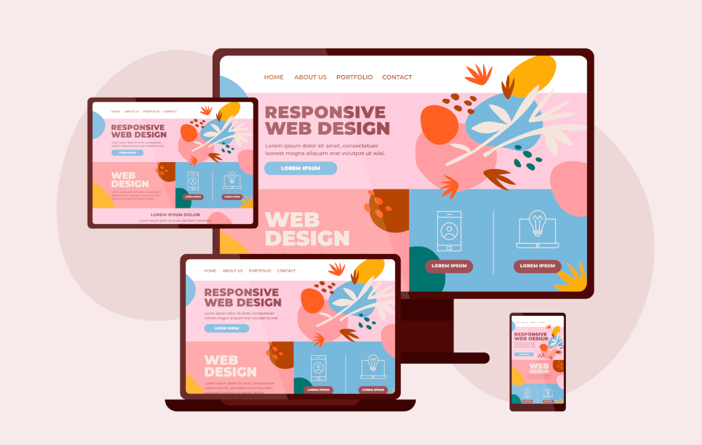
In an era where mobile devices dominate internet usage, having a responsive website is not just a luxury—it’s a necessity. Responsive web design ensures that your website looks and functions flawlessly on all devices, from desktops to smartphones. At Chira Solutions, we emphasize the significance of responsive websites in delivering an optimal user experience and boosting your online presence. Let’s explore why responsive design is crucial and how it can benefit your business.
What is Responsive Web Design?
Responsive web design is an approach that allows a website to adapt its layout and content to different screen sizes and orientations. This is achieved through flexible grids, layouts, images, and CSS media queries. The goal is to provide a seamless and consistent user experience across all devices, whether a user is browsing on a desktop, tablet, or smartphone.
Why Responsive Design Matters
- Enhanced User Experience
User experience is paramount in the digital age. A responsive website ensures that visitors can easily navigate and interact with your site, regardless of the device they are using. This reduces frustration, increases engagement, and encourages users to stay on your site longer.
- Increased Mobile Traffic
With more than half of all web traffic coming from mobile devices, it’s essential that your website is mobile-friendly. A responsive design ensures that your site caters to this growing audience, providing a positive experience that keeps users coming back.
- Improved SEO Performance
Search engines like Google prioritize mobile-friendly websites in their search results. A responsive design can improve your site’s SEO performance, making it more likely to appear at the top of search engine results pages (SERPs). This can lead to increased visibility and more organic traffic.
- Cost-Effective Maintenance
Maintaining separate desktop and mobile versions of your website can be time-consuming and expensive. A responsive design streamlines this process by consolidating your site’s content and layout into a single, adaptable framework. This makes updates and maintenance more efficient and cost-effective.
- Higher Conversion Rates
A seamless user experience across all devices can lead to higher conversion rates. When users can easily navigate your site and find what they’re looking for, they are more likely to take desired actions, such as making a purchase or filling out a contact form.
- Future-Proofing Your Website
As new devices and screen sizes continue to emerge, a responsive design ensures that your website remains accessible and functional. This future-proofing approach helps your site stay relevant and user-friendly in a rapidly evolving digital landscape.
Key Elements of Responsive Web Design
- Fluid Grids
Fluid grids use relative units like percentages, rather than fixed units like pixels, to define the layout of a website. This allows the design to resize proportionally to the screen size, ensuring that the layout remains consistent across different devices.
- Flexible Images
Flexible images adjust to fit within the confines of a responsive grid. This prevents images from appearing too large or too small on different screens, maintaining their quality and visual appeal.
- CSS Media Queries
CSS media queries allow designers to apply specific styles based on the characteristics of the device, such as its width, height, or orientation. This enables the website to adapt its layout and design elements to suit various screen sizes and resolutions.
- Mobile-First Approach
A mobile-first approach involves designing the mobile version of a website first, then progressively enhancing the design for larger screens. This ensures that the most critical elements of the site are optimized for smaller devices, providing a solid foundation for the desktop version.
How Chira Solutions Can Help
At Chira Solutions, we specialize in creating responsive websites that deliver exceptional user experiences. Our team of expert designers and developers works closely with you to understand your business needs and create a website that reflects your brand identity while providing a seamless experience across all devices.
Our Responsive Web Design Services Include:
- Custom Design: Tailored designs that align with your brand and business objectives.
- Cross-Device Compatibility: Ensuring your website looks and functions flawlessly on desktops, tablets, and smartphones.
- Performance Optimization: Implementing best practices to ensure fast load times and smooth navigation.
- SEO Integration: Optimizing your site for search engines to improve visibility and drive organic traffic.
- Ongoing Support and Maintenance: Providing continuous support to keep your site up-to-date and performing optimally.
Conclusion
In today’s digital world, a responsive website is essential for providing a positive user experience, improving SEO performance, and increasing conversion rates. By investing in responsive design, you can ensure that your website remains accessible, functional, and visually appealing across all devices. At Chira Solutions, we are committed to helping you achieve these goals with our expert responsive web design services.
Ready to transform your website into a responsive, user-friendly platform? Contact Chira Solutions today to discuss your project and discover how we can help you create a website that stands out in the digital landscape. Let’s build something great together!